Resources - Definitions and Examples
Background
The part of a picture or scene that appears to be farthest away from the viewer, usually nearest the horizon. This is the opposite of the foreground. Between background and foreground is the middle ground.
Balance
A principle of design, balance refers to the way the elements of art are arranged to create a feeling of stability in a work; a pleasing or harmonious arrangement or proportion of parts or areas in a design or composition. Portions of a composition can be described as taking on a measurable weight or dominance, and can then be arranged in such a way that they appear to be either in or out of balance, or to have one kind of balance or another. Balance can be symmetrical, or formal; or it can be asymmetrical, or informal. It can also be radial.
Balance comes to us from those devices having two pans or plates, and a pivoting suspension from a central axis that permits comparison of the weights of things on the two pans. When the weights on the two sides are equal, the pans are level — balanced. One need know only the exact weight of things on one side, because when the device is level, the unknown weight must equal the known one. Linguistically, the origin is in Latin: bi meaning two is joined to lancia meaning pans.
Symmetric balance occurs when the two sides are identical — they reflect each other: Latin syn meaning same is joined to metric meaning measure. Asymmetric balance is different: the Latin prefix a- means not, so asymmetry lacks balance; it is off-kilter. Radial balance is the kind found in another device: a gyroscope — essentially a spinning wheel.
Chiaroscuro
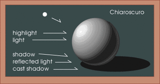
A word borrowed from Italian ("light and shade" or "dark") referring to the modeling of volume by depicting light and shade by contrasting them boldly.
This is one means of strengthening an illusion of depth on a two-dimensional surface, and was an important topic among artists of the Renaissance.
This is one means of strengthening an illusion of depth on a two-dimensional surface, and was an important topic among artists of the Renaissance.
Collage
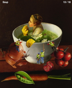
Soup, 2011, Susan Legind, Collage
A picture or design created by adhering such basically flat elements as newspaper, wallpaper, printed text and illustrations, photographs, cloth, string, etc., to a flat surface, when the result becomes three-dimensional, and might also be called a relief sculpture / construction / assemblage. Most of the elements adhered in producing most collages are "found" materials. Introduced by the Cubist artists, this process was widely used by artists who followed, and is a familiar technique in contemporary art.
"Collage" was originally a French word, derived from the word coller, meaning "to paste."
Susan Legind is by far one of the most talented Collage artists I personally have seen in her artist statement she writes "Rearrange objects just a little bit, and watch what happens. Not only does it change their interdependence, but our own perception of each object changes too. This process fascinates me and is the “driving force” behind my collages. Move a small insignificant detail forward, and it suddenly becomes a major “character”; move it back again - and it resumes its insignificance. There are no rules to this fascinating “game”; the sky is the limit! All my material was originally used for other purposes. Tearing, cutting, pasting and imagination surprise me with a “recycled” image with its very own distinct identity!"
Color
Produced by light of various wavelengths, and when light strikes an object and reflects back to the eyes.
An element of art with three properties: (1) hue or tint, the color name, e.g., red, yellow, blue, etc.: (2) intensity, the purity and strength of a color, e.g., bright red or dull red; and (3) value, the lightness or darkness of a color.
When the spectrum is organized as a color wheel, the colors are divided into groups called primary, secondary and intermediate (or tertiary) colors; analogous andcomplementary, and also as warm and cool colors.
Colors can be objectively described as saturated, clear, cool, warm, deep, subdued, grayed, tawny, mat, glossy, monochrome, multicolored, particolored, variegated, orpolychromed.
Some words used to describe colors are more subjective (subject to personal opinion or taste), such as: exciting, sweet, saccharine, brash, garish, ugly, beautiful, cute,fashionable, pretty, and sublime.
Sometimes people speak of colors when they are actually refering to pigments, what they are made of (various natural or synthetic substances), their relativepermanence, etc.
Photographers measure color temperature in degrees kelvin (K).
Color - Primary Colors

The colors yellow, red (magenta), and blue (cyan) from which it is possible to mix all the other colors of the spectrum — also known as the subtractive or colorant primaries. Thus pigmentsthat reflect light of one of these wavelengths and absorb other wavelengths may be mixed to produce all colors. Also, the light (-source) primaries: Lights of red, green, and blue wavelengths may be mixed to produce all colors. Light primaries are used in theatrical stage lighting, and in color video and computer screens.
Color - Secondary Colors
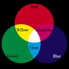
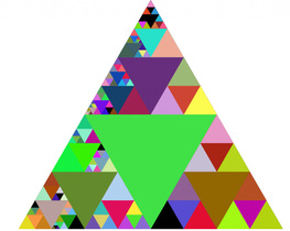
The colors obtained by mixing equal amounts of two primary colors. The secondary colors in subtractive color mixing (when the sources of color are pigmentsor reflective surfaces instead of light itself) are orange, green, and violet, as in the diagram and the picture to the right. (In this diagram, where do the primary colors — red, yellow, and blue — belong?)
In additive color mixing (when the sources of color are light sources instead of reflective surfaces), the secondary colors are magenta, yellow, and cyan. Also see color wheel, and see intermediate colors, which are sometimes called tertiary colors.
Also see CMYK (cyan magenta yellow black) and RGB (red green blue).
Color - Tertiary (aka Intermediate Colors)
Color produced by mixing unequal amounts of two primary colors. For example, adding more red to the combination of red and yellow will produce the intermediate color of red-orange. Intermediate colors are located between the primary and secondary colors on a color wheel. Other intermediate colors are orange-yellow, yellow-green, green-blue, blue-violet, and violet-red (also known as purple) — all colors in the spectrum except violet-red — a mixture of the two colors at the extremes of the visible spectrum.
Contrast
A large difference between two things; for example, hot and cold, green and red, light and shadow. Closely related toemphasis, a principle of design, this term refers to a way of juxtaposing elements of art to stress the differences between them. Thus, a painting might have bright color which contrast with dark colors, or angular shapes which contrast with curvaceous shapes. Used in this way, contrast can excite, emphasize and direct attention to points of interest.
Contrast came to English from the Latin word contrastare, formed by combining contra meaning against with stare meaning to stand.
When paired with compare, as in "compare and contrast," "compare" emphasizes similarities while "contrast" emphasizes differences.
Related link:
Contrast came to English from the Latin word contrastare, formed by combining contra meaning against with stare meaning to stand.
When paired with compare, as in "compare and contrast," "compare" emphasizes similarities while "contrast" emphasizes differences.
Related link:
Crop / Cropping
To crop is to trim one or more of a picture's edges, or to place one or more of the edges of an image so that only part of a subject can be seen within the image.
Elements of Art
The basic components used by the artist when producing works of art. Those elements are color, value, line, shape, form, texture, and space. The elements of art are among the literal qualities found in any artwork.
Emphasis
A forcefulness that gives importance or dominance (weight) to some feature or features of an artwork; something singled out, stressed, or drawn attention to by means of contrast, anomaly, or counterpoint foraesthetic impact. A way of combining elements to stress the differencesbetween those elements and to create one or more centers of interest in a work. Often, emphasized elements are used to direct and focus attention on the most important parts of a composition — its focal point. Emphasis is one of the principles of design. A design lacking emphasis may result inmonotony.
Emphasis originated in the root of the Greek word emphainein, to exhibit or display.
Emphasis originated in the root of the Greek word emphainein, to exhibit or display.
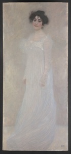
Serena Pulitzer Lederer, 1899, Gustav Klimt, Oil on Canvas, Metropolitan Museum of Art, New York, New York
Gustav Klimt (Austrian, 1862-1918), Serena Pulitzer Lederer (died 1943), 1899, oil on canvas, 75 1/8 x 33 5/8 inches (190.8 x 85.4 cm), Metropolitan Museum of Art, NY. The head in this portrait is emphsized by contrasting its dark features to the whiteness everywhere else.
Eurythmy
Harmony of proportion or movement. Among the principles of design, eurythmy is a hybrid of three of the principles — harmony, proportion, and movement.
Foreground
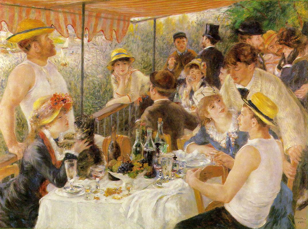
The Luncheon of the Boating Party (Le déjeuner des canotiers),
1881 Pierre-Auguste Renoir, Oil on canvas, Phillips Collection, Washington DC
The area of a picture or field of vision, often at the bottom, that appears to be closest to the viewer. Also, to give priority to one aspect of a thing over another. (This painting by Renoir contains a still life in the foreground and is the focal point of the painting.)
Form
In its widest sense, total structure; a synthesis of all the visible aspects of that structure and of the manner in which they are united to create its distinctive character. The form of a work is what enables us toperceive it.
Form also refers to an element of art that is three-dimensional (height, width, and depth) and encloses volume. For example, a triangle, which is two-dimensional, is a shape, but a pyramid, which is three-dimensional, is a form.Cubes, spheres, ovoids, pyramids, cone, and cylinders are examples of various forms.
Also, all of the elements of a work of art independent of their meaning. Formal elements are primary features which are not a matter of semantic significance — including color, dimensions, line, mass, medium, scale, shape, space,texture, value; and the principles of design under which they are placed — including balance, contrast, dominance,harmony, movement, proportion, proximity, rhythm, similarity, unity, and variety.
Triangles are shapes whereas pyramids are form
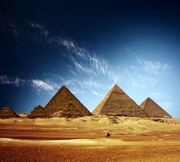
Pyramids are forms whereas triangles are shapes
Gesture Drawing
The act of making a sketch with relatively loose arm movements (gestures) — with the large muscles of the arm, rather than with the small muscles of the hand and wrist of the artist. Or a drawing made this way. Gesture drawing is both widely considered an important exercise in art education, and a common practice artists use in "warming up" at the start of any new work. A gesture drawing is typically the first sort of drawing done to begin a more finished drawing or painting. It is used to block in the layout of the largest shapes in a composition. There are compelling reasons too for artists to make gesture drawings simply for the sake of making them. The act of gesture drawing trains the simultaneous workings of the eyes, the brain, and the hand, especially in the act of drawing from life — from direct observation of a subject. Intensifying this learning experience is the practise of gesture drawing at great speeds — drawings made in as long as five minutes, and as short as a few seconds. Gesture drawing is likely to increase awareness of underlying structures, both in the subject of the work and in the work itself. The subject of a gesture drawing can be any at all, although the artists who made each of the following examples chose to make life drawings — of human models.

artlex.com Gesture Drawing Example by Jessica Hickman, 'Four Gesture Drawings on One Sheet, Pen and Paper
Hatching and Cross-Hatching
Still Life with Very Fine Hatching, 1933, Giorgio Morandi, Tate Museum, London, UK
Creating tonal or shading effects with closely spaced parallel lines. When more such lines are placed at an angle across the first, it is called cross-hatching. Artists use this technique, varying the length, angle, closeness and other qualities of the lines, most commonly in drawing, linear painting, engraving, and ethnic. Hatching is also referred to with the French word hachure.
A value scale produced with pen and ink on white paper by hatching and cross hatching:
A value scale produced with pen and ink on white paper by hatching and cross hatching:

Horror Vacui
The compulsion to make marks in every space. Horror vacui is indicated by a crowded design. In Latin, it is literally, "fear of empty space" or "fear of emptiness." Some consider horror vacui one of the principles of design. Those who exclude it from their list of principles apparently interpret it as posessing an undesirable, perhaps obsessive quality, in contrast to the desirable, controlled principle of limitation, or perhaps to that of emphasis or dominance.
The Fairy Feller's Master-Stroke (below) by Richard Dadd exhibits horror vacui. After murdering his father in 1843, Dadd was diagnosed as insane and spent the rest of his life in asylums. Cut off from the outside world, he produced a series of paintings which combine a remarkable attention to detail with an individual, manic intensity. The horror vacui seen in Dadd's pictures may be a result of his severe mental illness.
The Fairy Feller's Master-Stroke (below) by Richard Dadd exhibits horror vacui. After murdering his father in 1843, Dadd was diagnosed as insane and spent the rest of his life in asylums. Cut off from the outside world, he produced a series of paintings which combine a remarkable attention to detail with an individual, manic intensity. The horror vacui seen in Dadd's pictures may be a result of his severe mental illness.
Hue
The name of any color as found in its pure state in the spectrum or rainbow, or that aspect of any color. May refer to a particular wavelength. Pigment colors combine differently than colors of light. The primary colors (in pigment: red, yellow, and blue; in light: red, green, and blue) together with the secondary colors (in pigment: orange, green, and violet; in light: cyan, magenta, and yellow) form the chief colors of the spectrum.
Also see brilliant, color wheel, complementary colors, cool colors, dark, deep, monochrome, pale, push and pull,saturation, tint, tone, value, and warm colors.
Also see brilliant, color wheel, complementary colors, cool colors, dark, deep, monochrome, pale, push and pull,saturation, tint, tone, value, and warm colors.
Limit and Limitation
Limitation is showing restraint, taking something only so far and then stopping before doing to much; a principle of design in contrast to horror vacui, and to emphasis or dominance.
"Creativity arises out of the tension between spontaneity and limitations, the latter (like the river banks) forcing the spontaneity into the various forms which are essential to the work of art or poem." ~ Rollo May, psychologist, The Courage to Create, 1975.
"Creativity arises out of the tension between spontaneity and limitations, the latter (like the river banks) forcing the spontaneity into the various forms which are essential to the work of art or poem." ~ Rollo May, psychologist, The Courage to Create, 1975.
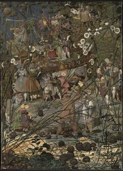
The Fairy Feller's Master-Stroke, 1855-64, Richard Dadd, Oil Paint on Canvas, Tate Britain, London, UK
Line
A mark with length and direction(-s). An element of art which refers to the continuous mark made on some surface by a moving point. Types of line include: vertical, horizontal, diagonal, straight or ruled, curved, bent, angular, thin, thick or wide, interrupted (dotted, dashed, broken, etc.), blurred or fuzzy, controlled, freehand, parallel,hatching, meandering, and spiraling. Often it defines a space, and may create an outline or contour, define a silhouette; create patterns, ormovement, and the illusion of mass or volume. It may be two-dimensional (as with pencil on paper) three-dimensional (as with wire) or implied (the edge of a shape or form).
Medium
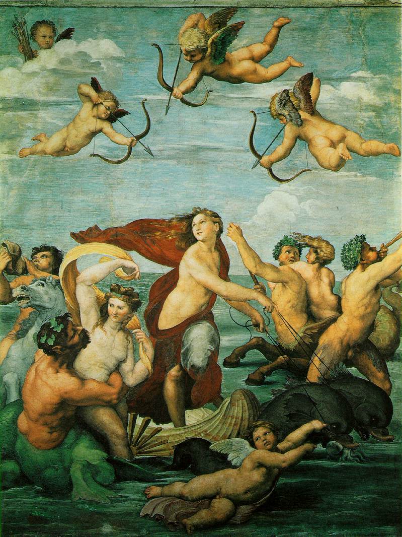
The Nymph Galatea, c. 1512-14, Raphael Sanzio, Fresco, Villa Farnesina, Rome
The material or technique used by an artist to produce a work of art.
Media is the plural form of medium. Also, may refer to mass media, which includes such printed media as books, magazines, and newspapers; radio; cinema; and such electronic media as television, Web pages, CD-ROMs, DVDs, etc. The term new media has become widely used from the early 1990s to refer to the latest electronic media, as well as what effects are now possible with recently developed hardware devices and software.
Medium can also refer to what carries a paint's pigments, and is also called a vehicle or a base. The medium is what determines what kind of paint is produced. A painter can mix a medium with its solvents, pigments and other substances in order to make paint and control its consistency. A variety of mediums are available that provide a matte, semi-gloss, or glossy finish.
(For Example, The Nymph Galatea by Raphael is a Fresco and Fresco's medium is plaster.)
Mixed Media (Mixed-Media)
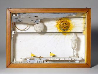
Suzy's Sun, 1957, Joseph Cornell, Mixed Media, North Carolina Museum of Art
A technique involving the use of two or more artistic media, such as ink and pastel or painting and collage, that are combined in a single composition. The term intermedia is used synonymously. (Avoid using "multimedia" as a synonym, because that is likely to cause confusion.)
In Suzy's Sun, 1957, Joseph Cornell, Mixed Media (Including wood, glass, plastic, metal, tempera, cork, seashell, paper), at the North Carolina Museum of Art the artist used several media to create this shadow box work of art.
In Suzy's Sun, 1957, Joseph Cornell, Mixed Media (Including wood, glass, plastic, metal, tempera, cork, seashell, paper), at the North Carolina Museum of Art the artist used several media to create this shadow box work of art.
Movement
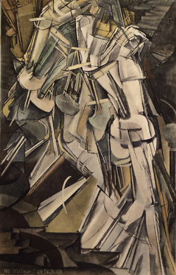
Nude Descending A Staircase (no. 2), 1912, Marcel Duchamp, Oil on Canvas, The Philadelphia Museum of Art, Philadelphia, PA
The act or process of moving, especially change of place or position, an effort. This can either be actual motion or it can be implied — the arrangement of the parts of an image to create a sense of motion by using lines,shapes, forms, and textures that cause the eye to move over the work. A principle of design, it can be a way of combining elements of art to produce the look of action. In a painting or photograph, for instance, movement refers to a representation or suggestion of motion. In sculpture too, movement can refer to implied motion. On the other hand, mobiles and kineticsculptures are capable of actual motion as well.
Movement in a second sense: An art movement is an artistic trend or tendency seen in the intentions or works of a number of artists, because there is a striking similarity among the techniques or methods they have taken, or in the attitudes which they espouse in a (more or less) organized effort.
Movement in a second sense: An art movement is an artistic trend or tendency seen in the intentions or works of a number of artists, because there is a striking similarity among the techniques or methods they have taken, or in the attitudes which they espouse in a (more or less) organized effort.
Pattern
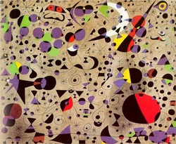
The Poetess, 1940, Joan Miro
The repetition of any thing — shapes, lines, or colors -- also called a motif, in a design; as such it is one of the principles of design.
There are ten classes of patterns, each with a particular function, that make up the entire physical world — natural and human-made — at all scales:
Pattern comes to us from pater, Latin for father, and shares this origin with patron, paternal, and patriarchal. The Latin patronus means defender, protector, lord, or master. What pattern shares with each of these words is the notion of a role model. A pattern presents an idea that is highly worthy of imitation. Indeed imitation is so essential to pattern that it can be found in every example.
There are ten classes of patterns, each with a particular function, that make up the entire physical world — natural and human-made — at all scales:
- spheres
- mosaics or nests
- lattices
- polyhedra
- spirals — helixes and volutes
- meanders
- branching and circulation
- waves
- symmetry
- fractals
Pattern comes to us from pater, Latin for father, and shares this origin with patron, paternal, and patriarchal. The Latin patronus means defender, protector, lord, or master. What pattern shares with each of these words is the notion of a role model. A pattern presents an idea that is highly worthy of imitation. Indeed imitation is so essential to pattern that it can be found in every example.
Point of View
A position or angle from which something is observed or considered, and the direction of the viewer's gaze; a standpoint which is either a physical location or one in the mind. Examples of the points of view possible in a picture are: from below, from inside, from outside, from above, and so on. A manner of viewing things; an attitude. The attitude or outlook of a narrator or character in a piece of literature, a movie, or another art form. In discussing art, to use the common synonym "perspective" may be confusing.
Principles of Design
Certain qualities inherent in the choice and arrangement ofelements of art in the production of a work of art. Artists "design" their works to varying degrees by controlling and ordering the elements of art. Considering the principles is especially useful in analyzingways in which a work is pleasing in formal ways. How any work exhibits applications of these principles can further or modify other characteristics of a work as well.
Some principles overlap or oppose others, and some are viewed as more important, more ideal, more relevant or irrelevant (or even undesirable) than others. So it is understandable that various authorities' lists of principles differ one from another. Several authorities do not include the concepts marked here with an asterisk (*). The primary reason for this variation appears to be disagreement about whether principles are ideals — concepts found in the best designs / art — or design issues we benefit from understanding and considering in order to more thoughtfully produce, understand, and judge art and design. The trend is toward the second point of view. After all, there are needs for both the beautifuland the grotesque, the polished and the rough, and exceptions to many rules.
See articles about each of the principles of design / art:
- balance (the several kinds: symmetry, asymmetry, and radial)
- emphasis (largely synonymous with dominance)
- eurythmy * (a combination of harmony, proportion, and movement)
- harmony * (compare to unity, tension, and variety)
- horror vacui * (in contrast to limitation, and emphasis or dominance, the principle most often cited as undesirable)
- limitation * (in contrast to horror vacui, and emphasis or dominance)
- movement
- pattern (often paired with rhythm)
- proportion
- rhythm (often paired with pattern)
- tension * (compare to unity, harmony, and variety)
- unity (largely synonymous with coherence and homogeneity)
- variety (often contrasted with unity)
Proportion
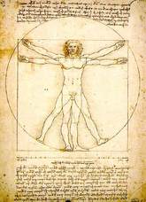
Study of Proportion, Leonardo da Vinci, from Vitruvius's De Architectura, pen and ink, Accademia, Venice
A principle of design, proportion refers to the comparative, proper, or harmonious relationship of one part to another or to the whole with respect to size, quantity, or degree; a ratio.
Proportion came to English in the Latin word proportionem, meaning comparative relation.
Often proportion is allied with another principle of art, emphasis. For example, if there is a greater number of intense hues than dull hues in a work, emphasis is suggested. For another example, if one figure is made to look larger compared to other figures in a composition, it is said to be out of proportion and is given greater importance.
Rhythm
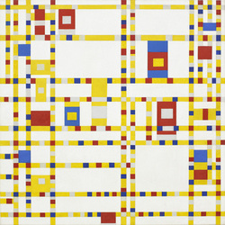
Broadway Boogie Woogie, 1942-43, Piet Mondrian, Oil on Canvas, MOMA
A visual tempo or beat. The principle of design that refers to a regular repetition ofelements of art to produce the look and feel of movement. It is often achieved through the careful placement of repeated components which invite the viewer's eye to jump rapidly or glide smoothly from one to the next.
In any artwork, it is possible to distinguish between rhythm of color, line, and form. In the continuity of the three comes the whole rhythm of that work.
Rhythm unites the visual culture with music, but in visual culture, rhythm is more evident in the applied arts than in the fine arts. In the former, it is often the foremost means of aesthetic expression.
Rhythm originated in the Greek word rhymthmos, meaning measured flow, which they passed into Latin as rhythmus, meaning movement in time. Its first uses in English were literary, in reference to themetrical rhyming of verses. English speakers began to use rhythm concerning repetition of musical beats in the late 18th century, and about visual elements in the same period.
Each artist, every period, every culture produces a characteristic sort of rhythm. Recognizing a work's rhythmical peculiarities often aids in identify the culture or time in which it was produced, if not the individual artist who produced it.
Rhythm's importance can be demonstrated by noting how many important rhythmic cycles we observe in nature — consider the alternating tension and relaxation in the heart's beating or in the ocean's waves, the revolutions of the earth around the sun, the comings and goings of generations. Each of us has personal rhythms to our days, weeks, and years. Life, indeed, would be chaotic without rhythm. Participating in the tempo of this flow gives us excitement and calm, yearning and contentment, yin and yang. It is natural that we would employ rhythms to organize and unify our works, much as they do the rest of our experience.
There are several types of visual rhythm. These include:
regular rhythms - The background design behind this text has a regular rhythm. (In the following examples, let the letters A, B, etc. stand for visual elements of any sort)
AB-AB-AB is the most common type. Picture alternating stripes of two colors, for instance. (In English prosody, a student of poetry might read this as either "iambs" or "trochees". An iamb is a metrical foot consisting of two syllables, the first syllable accented, the second accented, as in AB-AB-AB. It becomes trochaic meter if the accenting is reversed, as in AB-AB-AB.)
Some more examples:
ABC-ABC-ABC (In English prosody, a student of poetry might read this as "anapests" or "dactyls". An anapest is a metrical foot consisting of three syllables, the first two syllables unaccented, the third accented, as in ABC-DEF-GHI-JKL. A dactyl consists of three syllables, the first accented, the second and third unaccented, as inABC-DEF-GHI-JKL.)
ABBB-ABBB-ABBB / ABCB-ABCB-ABCB / ABCDCDA-ABCDCDA-ABCDCDA
alternating rhythms -
some examples:
ABA-CDC-ABA-EFE-ABA-CDC-ABA-EFE- / ABC-ABC-ABC-DEF-DEF-DEF-ABC-ABC-ABC-DEF-DEF-DEF- / ABCD-DCCBBA-ABCD-DCCBBA
progressive rhythms - Progression occurs when there is a gradual increase or decrease in the size, number, color, or some other quality of the elements repeated.
some examples:
AB-AABB-AAABBB-AAAABBBB / AB-AB-AB-AB-AB-AB / AB-AB-AB-AB-AB-AB- / ABC-ABD-ABE-ABF-ABG-ABH-ABI
flowing rhythms
random rhythms
Each of these types of rhythm might be altered periodically. Music theory might be defined as the study of rhythms and their periodic alterations.
Stipple and Stipple Brush
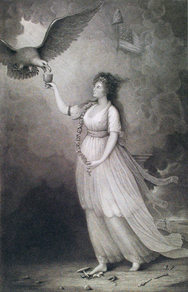
Liberty in the Form of the Goddess of Youth: Giving Support to the Bald Eagle, 1796, Edward Savage, Stipple Engraving On Cream Laid Paper, Worcester Art Museum, Worcester, MA
Stipple is a drawing, painting, or engraving method employingdots rather than lines. Stippled works can be produced with any of a variety of tools, including pencils, crayons, pens, and brushes. The broadly distributed bristles of this stipple brush are all the same length, allowing the application of a mass of fine dots. A stipple brush is often used by painters of faux textures — simulating granite and sandstonefor instance.
Surface
The outer or topmost boundary or layer of an object. Colors on any surface are determined by how incident rays of light strike it, and how a surface reflects, scatters, and absorbs those rays. The material qualities of a surface, as well as its form and texture further determine how it is seen and felt.
Tenebroso or Tenebrism
Tenebroso is an Italian word, literally meaning dark and gloomy. Both tenebroso and its English equivalent, tenebrism, refer to a style of paintingcharacterized by high contrast between light and shade — emphasis placed on chiaroscuro to achieve dark, dramatic effects. Frequently the main subjects of tenebrist pictures are illuminated by a single source of light, as if a spotlight shone upon them, leaving other areas in darkness. Such pictures have been called "night pictures" painted in the "dark manner." The most reknowned tenebrists have been "Caravaggio" (see example below), Michelangelo Merisi (Italian, 1571/73-1610), Georges De La Tour (French, 1593-1652), and Rembrandt van Rijn (Dutch, 1606-1669).
There is a relationship between tenebrists and other artists who portray night scenes — collectively known as nocturnes.
There is a relationship between tenebrists and other artists who portray night scenes — collectively known as nocturnes.
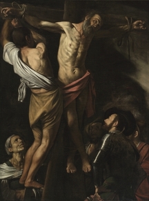
The Crucifixion of Saint Andrew, 1606-07, Caravaggio, Oil on Canvas, Cleveland Museum of Art, Cleveland, Ohio
Tension
A tenuous balance maintained in an object between opposing formal orallegorical forces or elements often causing anxiety (from dissonance to angst topain) or excitement (from the simply interesting to the utterly sublime). It embodies what is sometimes called edginess or frisson; and bears comparison to unity,harmony, and variety.
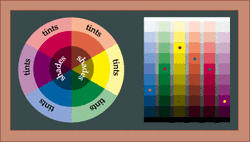
Tint
A soft and light color — one to which white has been added. For example, white added to green makes a lighter green tint. The illustration below diagrams colors of various values. Value changes from pure hues are called tints and shades. On the right, pure hues are marked by dots. The tints made from those hues are above them.
Tint can also refer to the name of whatever hue is dominant in a color. Something is tinted when color is added to it.
When light is projected, its color can be tinted by sending it through a filter.
The term "pastel" is used by some as a synonym for tints. First employed metaphorically by American fashionwriters in 1899, "pastel" in this sense might be understood in context, but art writers generally avoid this usage to prevent their readers' confusion. Failure to distinguish pastels (tints) from pastels (the medium) results in ambiguity.
Unity
The quality of wholeness or oneness that is achieved through the effective use of the elementsand principles of design. A totality that combines all of its parts into one complete, cohesive whole. Often it is realized through a deliberate or intuitive balancing of harmony and variety. However, this balance does not have to be of equal proportions. Harmony might outweigh variety, or variety might outweigh harmony. Harmony aids efforts to blend picture parts together to form a whole. Variety adds visual interest to this unified whole. A composition is unified when the relationships between its parts interact to create a sense that no portion of the composition may be changed without altering the aesthetic integrity and meaning of the artwork. When unity is achieved with insufficient harmony and variety, the result ismonotony. Unity is largely synonymous with coherence.
Value
An element of art that refers to luminance or luminosity — the lightness or darkness of a color. This is important in any polychromatic image, but it can be more apparent when an image is monochromatic, as in many drawings, woodcuts, lithographs, and photographs. This is commonly the case in much sculpture and architecture too.
A full range of values can also be produced by a variety of other means. These include hatching and stipple techniques, as well as with textures and patterns of other sorts.
The illustration diagram of colors attached to this definition is of various values. Value changes from pure hues are called shades and tints. On the right, pure hues are marked by dots. Notice how their values — their positions beside the gray scale — are varied.
Changes in value, whether sudden or gradual, can add greatly to the visual impact of art forms. Changes in value can also be used to help the artist express an idea.
Variety
A principle of design that refers to a way of combining elements of art in involved ways to achieve intricate and complex relationships. Variety is often obtained through the use of diversity and change by artists who wish to increase the visual interest of their work. An artwork which makes use of many different hues, values, lines, textures, and shapes would reflect the artist's desire for variety.Unity is the principle which is its variety's opposite; but when there is too little variety, the result is monotony.
All definitions on this page are provided by Artlex.com unless otherwise stated.